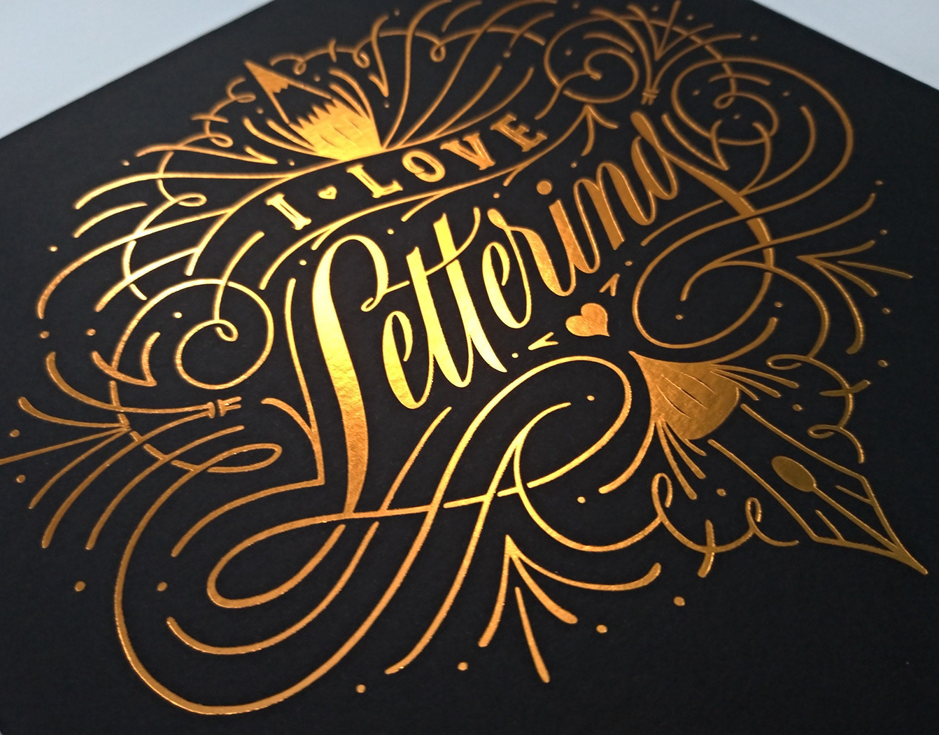
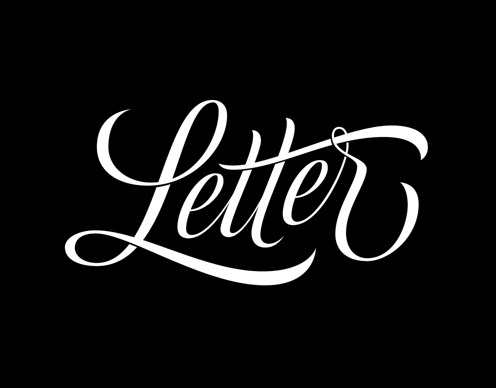
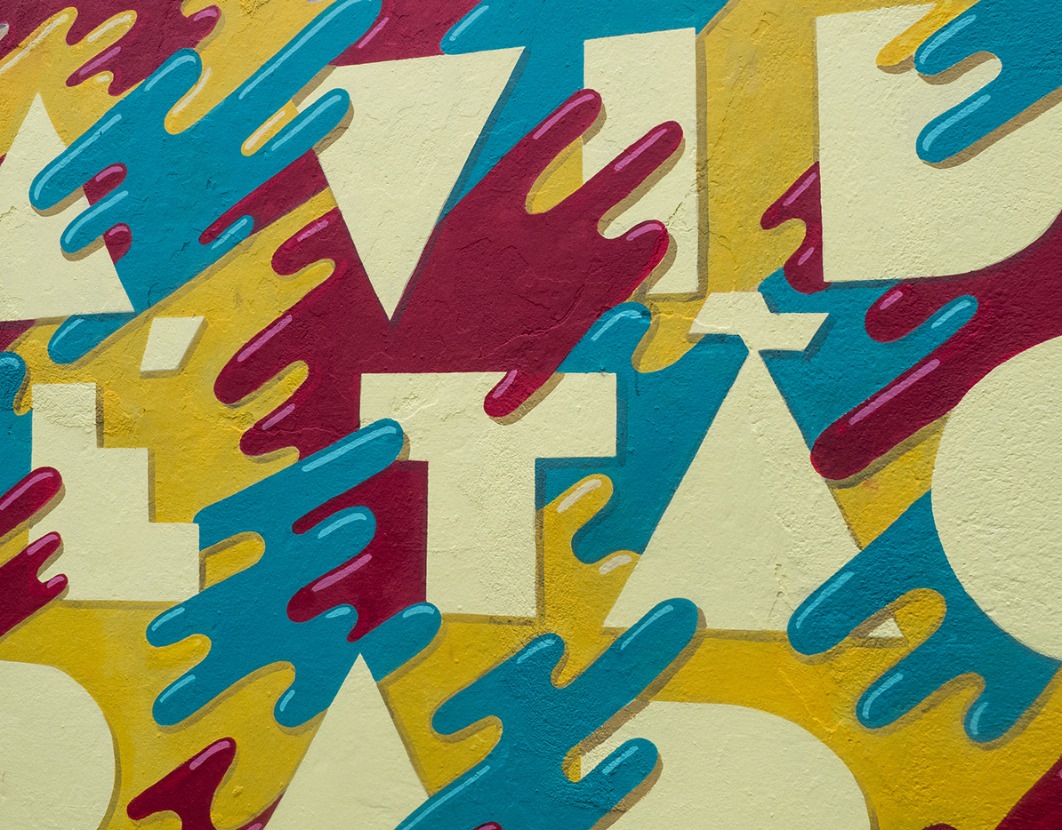
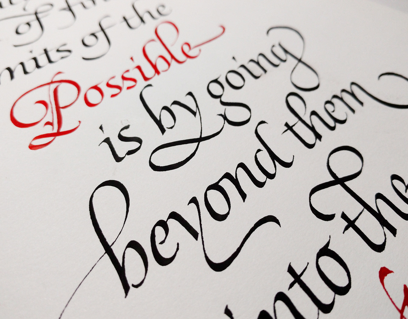
Lettering created for Letterpress Brasil, a local letterpress printing studio ran with love
by my good friend and mentor Marcos Mello and his wife Patricia Passos.
by my good friend and mentor Marcos Mello and his wife Patricia Passos.
✏︎
The lettering in Portuguese unveils their motto:
“Letterpress: nossa arte, nossa vida”
“Letterpress: our art, our life”
They wanted the lettering piece to reflect their passion for the craft and how much they live and breathe letterpress. A promotional postcard they could gift to friends, collaborators and clients, beautifully printed in letterpress and silkscreen—a prime showcase of the finesse and attention to detail characteristic of their work.
this mockup doesn't even start making justice to the actual thing, but as soon as I get pictures of it I'll make sure to update here ;)
The Process
The process involved MANY rough sketches to figure out just the right style and composition for the piece, and other countless layers of tracing paper throughout the iterations and corrections. And an extra one just to test dimensional effects :)
Since this piece was to be so finely printed, many project decisions were made bearing in mind the printing processes’ limitations and possibilities. Getting this kind of technical feedback from the client and being in sync with them during the process was essential to have the outcome truly ready for print.
The vector process was a journey in itself: eternally nudging anchor points and bézier handles to get the curves just right, figuring out ways to construct letters as modules, or add the dimensional effects I wanted by fiddling with Illustrator's resources—always trying to save time, but getting too caught up in “manual” refinement anyway...
After this long journey of bézier pushing, I thought “Digital Craftsmanship” was just the term to define this, since the vector process can require just as much time dedication and attention to detail—if not obsessively more—than the analog part of the lettering (at least for me). It is a craft in itself—and like every craft, it takes time and dedication to master it.
After this long journey of bézier pushing, I thought “Digital Craftsmanship” was just the term to define this, since the vector process can require just as much time dedication and attention to detail—if not obsessively more—than the analog part of the lettering (at least for me). It is a craft in itself—and like every craft, it takes time and dedication to master it.
This was one of my first full lettering comissions back in 2014, and because of that, also one of the longest and most challenging letterings of my life (in terms of process length). I’ve learned so much through the making of this piece, not only about lettering in itself and digitizing, but also about understanding my own process and pushing my limits.
It’s much thanks to this piece that I’ve evolved so much as a lettering artist and freelancer since then. It’s one of those kind of works that are game changers in one’s career.
Really grateful to Letterpress Brasil for trusting me with this piece back then ♥︎
Special thanks as well to Carol Chikitani & Fabiana Tome from the Letterpress Brasil team, and also to my close friends and family for all the readability feedback through the iterations :)
Be sure to check out the fantastic work they do at @letterpressbr ;)
✏︎
Hope you enjoyed reading through the process.
Thanks for watching!
If you liked this project, please hit the ‘appreciate’ button below :)

