image credit: Cristina Pagnoncelli.
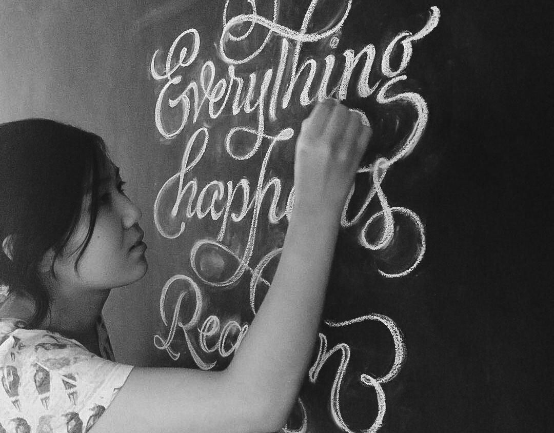
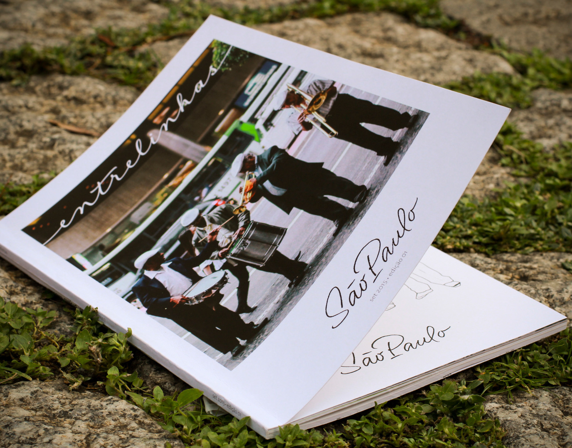
The “Lute Todos os Dias” or freely translated, “Fight Everyday” feminist calendar features the work of 15 women, either in the artworks featured in each month, cover, organization, graphic design, or typefaces in use.
Needless to say, I was beyond thrilled and fully on board when my friend and lettering boss-lady Cris Pagnoncelli invited me to contribute to the 2019 edition of her ongoing Feminist Calendar project!
The artwork I made especially for this occasion is a visual and personal interpretation and tribute to Simone de Beauvoir's memorable quote: “I accept the great adventure of being me”.
--
Lettering criado para a edição de 2019 do Calendário Feminista “Lute Todos os Dias” idealizado por Cristina Pagnoncelli, que conta com o trabalho de 15 mulheres incríveis. Veja mais sobre o calenário lá embaixo ;)
Minha contribuição traz uma homenagem e interpretação pessoal e visual de uma frase memorável de Simone de Beauvoir:
“Eu aceito a grande aventura de ser eu mesma”.
The Process
Concept
Since the calendar’s main themes revolve around feminine empowerment, resistance, and other related topics, I wanted to pick not just a quote that would relate to them but also resonate with me on a personal level, so that I could make something authentic, something that would have my whole heart poured into it.
Upon researching some quotes by memorable women, I selected a couple of them that spoke to me and the moment I was going through. I did explore a couple of them visually, but with Cris’ help, we ended up landing on Simone de Beauvoir's one as we felt it better reflected the calendar's intention.
Diving into this adventurous journey of self-knowledge is no easy task, and I believe that knowing and accepting oneself is an act of resistance in itself “in a world that's constantly trying to make you something else”, to half-quote Ralph Waldo Emerson. There are so many stereotypes built by patriarchy trying to dictate who/what we are or are not—us women have to constantly stand our ground, work twice as hard to be acknowledged, and fight for our voice to be heard.
Diving into this adventurous journey of self-knowledge is no easy task, and I believe that knowing and accepting oneself is an act of resistance in itself “in a world that's constantly trying to make you something else”, to half-quote Ralph Waldo Emerson. There are so many stereotypes built by patriarchy trying to dictate who/what we are or are not—us women have to constantly stand our ground, work twice as hard to be acknowledged, and fight for our voice to be heard.
But how do we find our voices as women if it has been historically and constantly silenced? (And sometimes even in how we were raised). While I am not close to finding the answer to that question, and still am in a journey of my own, this artwork is an arm extended, an invitation to dive into this complicated journey that is truly knowing and accepting oneself.
Personally, I think that understanding our own selves and our condition within our particular contexts and cultural background—who we are, how we fit into it, (do we really have to fit!?), what our voice is, what our calling is amidst all this, how we can fight in our own way, who is fighting beside us...all of it is an important step in owning our voice and speaking out.
Personally, I think that understanding our own selves and our condition within our particular contexts and cultural background—who we are, how we fit into it, (do we really have to fit!?), what our voice is, what our calling is amidst all this, how we can fight in our own way, who is fighting beside us...all of it is an important step in owning our voice and speaking out.
Accepting who we are is the first step into standing our ground in society—enforcing limits and not waivering when it pours its twisted expectations upon us. It armors us with a resolve that makes us strong enough to fall, get up and move on, because we are who we are, and that’s okay—that’s what makes us strong, special and unique.
First sketches
My process always begins with jotting the content down to get a sense of length and to define basic hierarchy. I usually underline the most important words or assign them a relevance order—this may change along the process but is an important starting guide.
For this quote, the most important words in my interpretation were “aventura” (adventure), then “aceito” (accept), and “eu mesma” (myself).
Then it’s all about thumbnail sketches. To me, they are fundamental to quickly explore possibilities of composition and style—at this stage, every (crazy) idea counts. By using this process, I can also get an immediate visual feedback of what works and what doesn’t, helping me to make a more informed decision on which way to go.
Letters tell stories
I explored a couple of variations for the letterforms and the composition, trying to figure out which could best visually represent the gist of the quote. I wanted the artwork to convey this sense of adventure, movement, bravery, embarking in an unknown journey. Since this is a very personal journey, I wanted to keep it human and somewhat imperfect, so I decided to go for cursive letters (to allude to handwriting), plus some quirky shapes (because that’s what makes us unique!).
What began as a ribbon in the first thumbnail, ended up becoming a “treasure map”, and that visual concept was key for defining the other elements later added in the composition. For this piece I really wanted to add some degree of illustration, so I brainstormed treasure-map related elements:
unfortunately, this is the only picture I have of this part of the process, but you can get the sense of what I was exploring ;)
The messy in-between
For this artwork, I wanted to challenge myself—I felt that as a personal project, this was my chance to take a leap and experiment with new things. And so I did. I went for a totally unusual aesthetic for me: mixed analog & digital, lettering, a bit of illustration, and cartography ephemera; tried using watercolor, colored pencils, hatching—techniques that I don't use very often but wish I did.
All those different elements made sense for the execution of the concept I had envisioned from the start, so I threw myself into the process and had some serious fun exploring the possibilities ;)
Here’s a gif showing the full process:
had a hard time figuring out this part (“myself”), so I did some calligraphic explorations to get this handwritten and quirky feel to the letterforms.
the ol’ paste up method never fails me in moments of indecision <3
Almost everything set on the “final” artwork paper; I used an improvised light table, plus decal to transfer some parts.
Inking outlines after painting with watercolor and acrylic.
The process behind the word “Aventura”. Sketch in pencil > Refined in pencil > Painting > Inking and final details.
Close up shot so you can see the textures :)
Another detail shot to show that inked goodness
Final version of artwork on paper before the digital touch ups and background fusion.
For more bits of the process (with videos and all), you can check out my IG stories highlights, under Calendar Process.
Final Credits
I feel super honored and grateful to be part of such a thoughtful and important project, standing beside such incredible, dedicated and badass fellow women, many of whom I'm lucky to be friends with, and whose work I've always admired.
This project has a special place in my heart as it has allowed me to jump into a journey of self-knowledge in itself through my immersion in its process and the new discoveries that arised within it. Very meta, huh? ;)
image credit: Cristina Pagnoncelli.
Sobre o projeto:
“A terceira edição do Calendário “Lute Todos os Dias” acontece com a participação de 15 mulheres. Todas doaram seu trabalho para que este projeto fosse possível.
Este projeto, idealizado pela designer e artista visual Cristina Pagnoncelli, tem como objetivo reverberar a voz e ampliar a visibilidade de várias mulheres que atuam de forma independente e autoral, além de unir e fortalecer conexões incentivando importantes discussões sobre os assuntos abordados.
Todo o lucro das vendas deste calendário foi doado (50/50) para o coletivo "Deixa Ela em Paz" e para o grupo “FabulosasCWB” de apoio às mulheres para financiar outras ações que fortaleçam e possibilitem novas oportunidades.”
Para ver mais sobre o calendário, confira o projeto na íntegra aqui.
Aline Kaori - Ana Laydner - Ana Matsusaki - Andrea Kulpas - Bruna Alcantara - Brunna Mancuso - Carol Pajuaba - Claudia Bär - Cyla Costa - Coletivo Deixa ela Em Paz - Flora de Carvalho - Lygia Pires - Tatiana Gottert - Stephanie Schafer - Cristina Pagnoncelli
~ ninguém solta a mão de ninguém.
All artworks are from the 2019 edition of the calendar and belong to their respective authors stated below each image.
If you made it here, thank you for reading through!
I hope you enjoyed seeing the process and hopefully could get something out of it.
(I’ll say it wasn’t easy to make such an in-depth case study!).
Likes and comments are always appreciated ;)
